
Awesome sauce and Pickles


Awesome sauce and Pickles

Farewell my classmates.
These are some awesome ones to visit and see what they did. I also commented on theirs.
https://babybenke.wordpress.com/2016/12/09/135/comment-page-1/#comment-23
https://janessapow.wordpress.com/2016/12/07/final-portfolio/
https://stevenclouse.wordpress.com/2016/12/07/final-portfolio/
Awesome sauce an’ Pickles!!!!!!!!!!!
13A Final Portfolio Slide Share
Process:
To begin I started to just put my projects in order of completion. I felt in some way each of my projects had an island link where it be the look, images, colors, or what or who it was about. So it helped me to come up with the pattern that I created and then tired to use throughout each of the slides.
Critique:
The critiques I received were so helpful, and made me look for ways to update, and improve my work. I received help from Johanna Agila, Abbie Foster, and of course Sister Walker. I was able to take into consideration many of the helpful hints, and missed a few as I have been busy with my classes, and many end of year functions. I provided critique to Chris and Lori.
Enjoy. MERRY CHRISTMAS…
View original post 2 more words
Awesome sauce an’ pickles
Process: The content for this project was all pulled from my finished projects posted within this blog. There were a few projects I added finishing touches to after they were graded. I took the comments given in each item’s grading to make them a little bit better before placing them in this portfolio. I wasn’t able to fix all of them, as my trial of Photoshop and InDesign expired, but I did fix my earlier projects. For example, I changed the special event flier by raising the Toys For Tots logo, and increased the header to decrease the gap between the header and the body copy. In my typography project, I removed the shape behind the body copy, changed the body copy text to better fit in the text box, and fixed the leading at the top.
Once the changes were made to the projects I could change, I started…
View original post 296 more words

Ida Johnson
An accumulation of my work for my COMM course at college.


This was a wonderful process, and way easier with those videos. This class is finally making sense to me now that I have great visual aides. This is a magazine spread for school on an article I wrote. Pictures are from cgtextures.com and enhancement by Adobe Photoshop.
My color scheme is yellow and purple, with Calibri Light as the title and quote, with Calisto as the body.
Thank You
hold-to-the-word-of-god


REVISED


This week for my Communications course we had to develope a web page using the FOCUS formula. This is all for a depression information and inspirational website where people can share there stories in a safe environment and we can learn from each others experiences. The website will be anonymous with only administrators and certified psychologists and therapists to assist those in need as well as for the information articles.
The color scheme I was trying to keep in the teal area, because it is one of my favorite colors and makes me happy. I think teal is a great color to represent depression and anxiety disorders. I also love the white boxes, although I explored other options.
No Critique this week.
Happy Thanksgiving!!!!!!!!!!!!!!!!!!!!!!!!!!!!!!!!!!!!!!!!


This week we had to make a movie poster with us in it. I first went for Delirium, but I didn’t like the way my eyes look. It took me 6 hours just to make that one. Then the second one, Wait for the Dawn, I made in like 30 minutes after finally watching some more youtube videos.The edge lighting is a little off, but oh well.
The second image is the one I am turning in for the project. It is using Script Bold for the title and Tw Cen MT for who it is starring. The back story is more of a message of hope. I have an awesome quote hanging on my wall that I painted a few years ago. It says “Faith is the bird that sings when the dawn is still dark.” The second image has three photos. The first is my highlighted face, the second is my face, and the third is the background, taken from Microsoft Backgrounds that I download on my computer.
This will also be on youtube. Thanks


This was my first time using Photoshop through Adobe. I had to do a lot of exploring on my own and many youtube videos, but I think I did okay. This is a project for school.
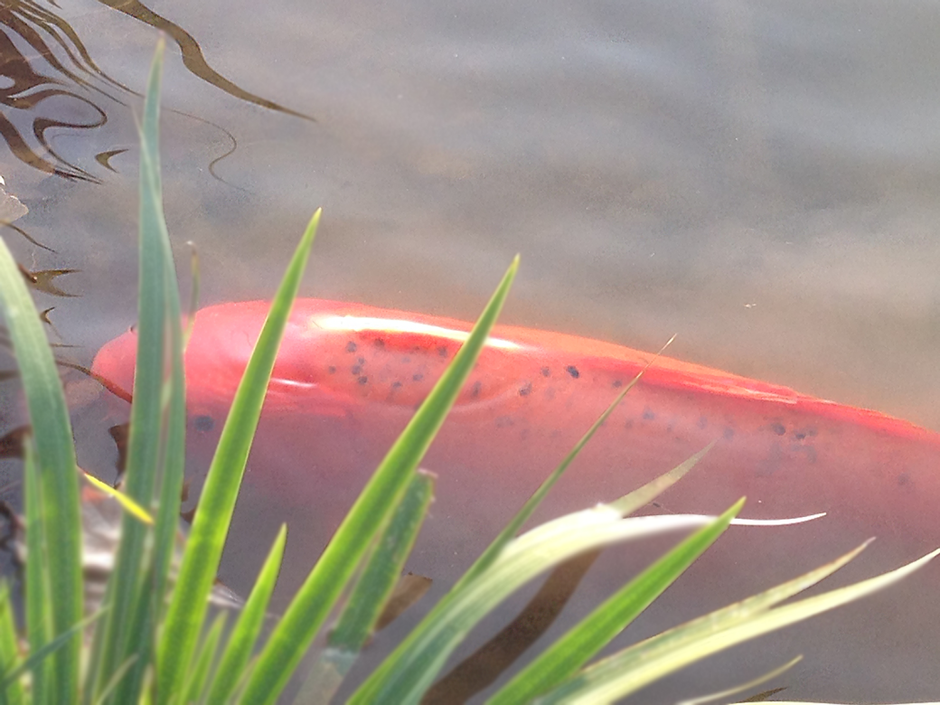
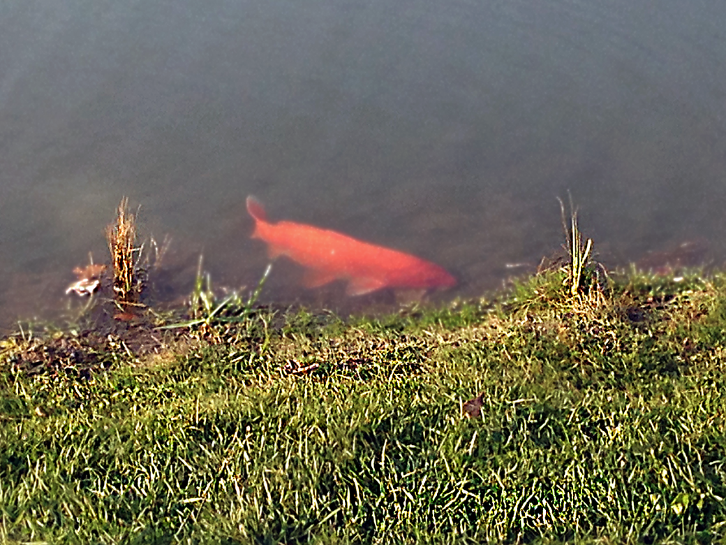
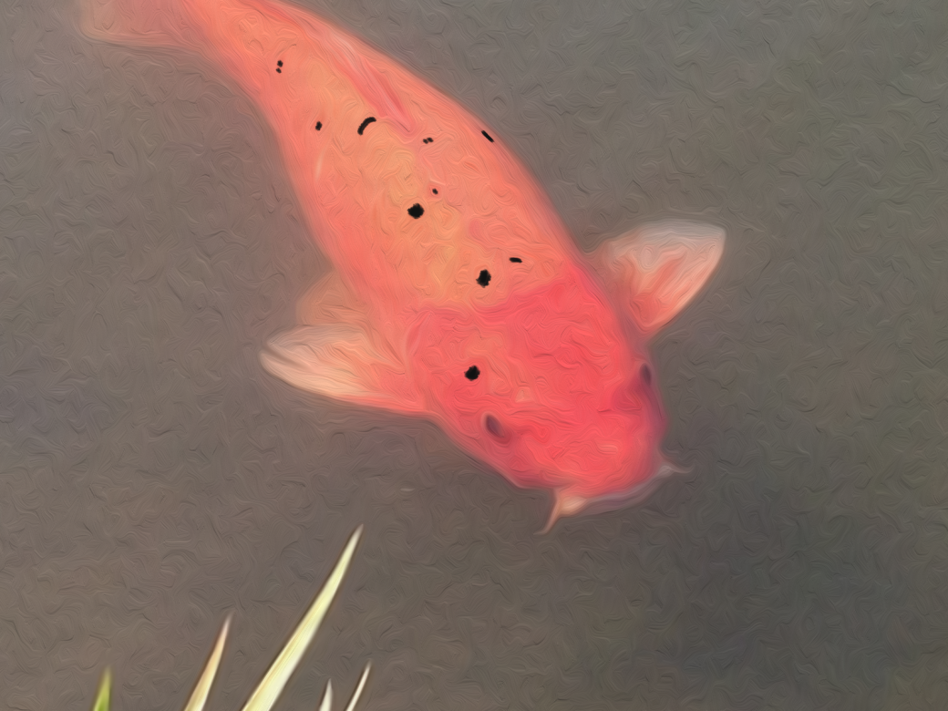
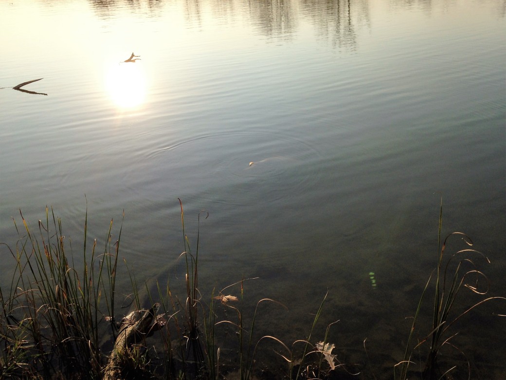
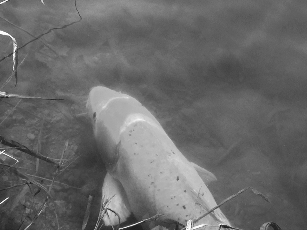
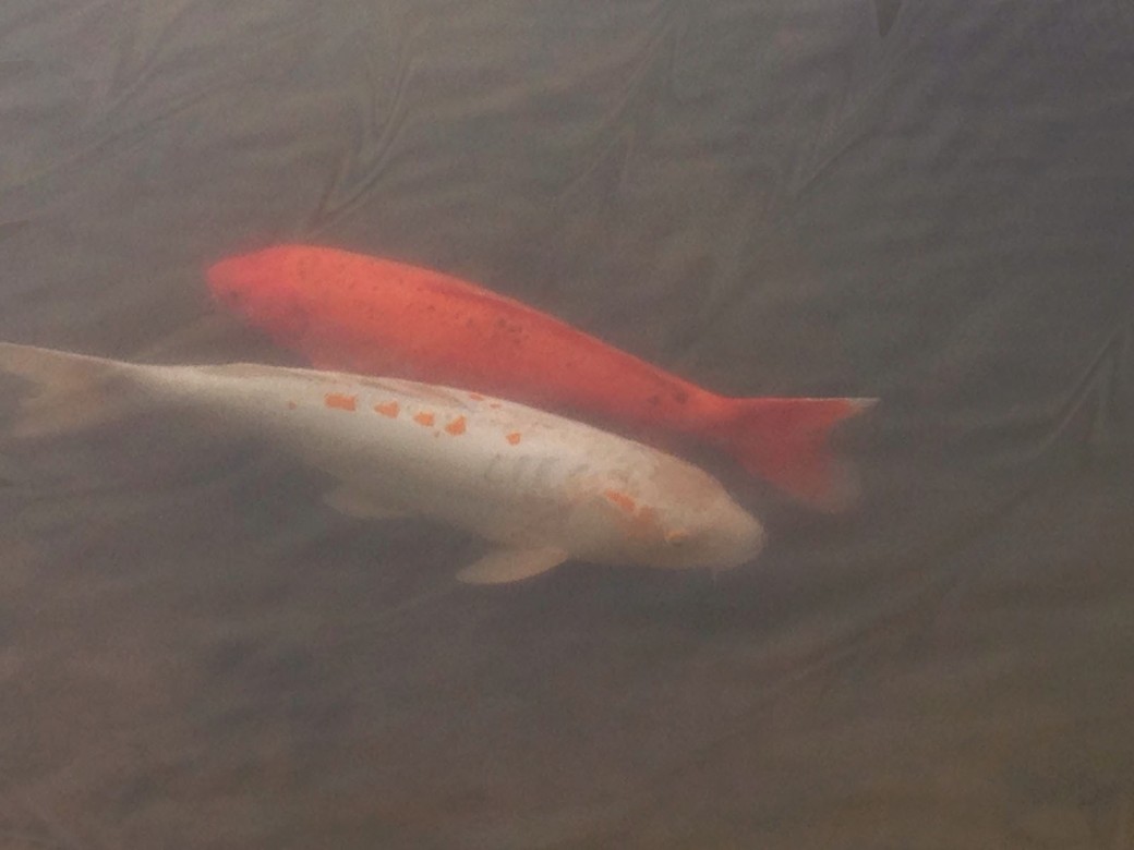
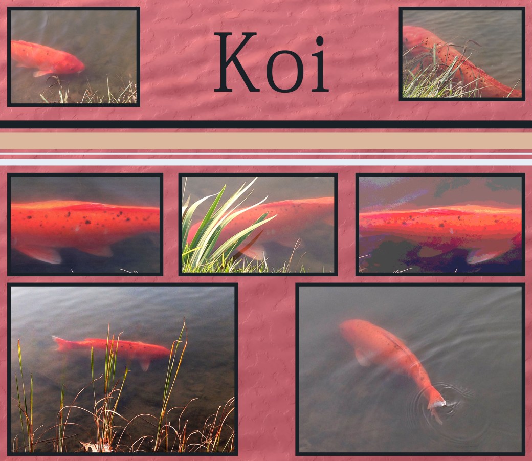
These photos were taken at our Cox Arboretum here in Dayton, Ohio. I was originally going to do a wonderful piece of the bridge over a turtle pond, but they are in the middle of constructing a new bridge. As I was leaving I captured some photos of the Koi fish. Then there was this great orange one, whom I have named Orangey, that would let me get close and he was very photogenic. I had a great time outside taking photos of him and his pond, even some of the other koi fish who would get close enough.
My texture used is that of the ripples from the same pond.
Thank You
I am not on Facebook to complete any critiques.
The picture titled “Raymond” is of a very pregnant koi, who would not get close, but I could get her tail.
